

Banning noise will be a disaster for statistical data products
Last week, the United States Department of Commerce issued an order declaring that "noise infusion" will be banned from all statistical products published by the Census Bureau and the Bureau of Economic Analysis.
What does it mean, and why should you care?
Context
Statistical products are a bunch of numbers published from a secret dataset. Often, that dataset contains confidential information, and it is important that the numbers don't reveal that information. The U.S. Census is a well-known example: the statistics are made public, but the contents of each form filled by individual U.S. residents must stay secret.
Scientists have developed a number of techniques that can be used to publish useful statistics while protecting the privacy of the original data. This field is called disclosure avoidance in statistical communities. Here are a few of these techniques.
- Suppression: removing data that doesn't pass certain thresholds (e.g. if a count of people is below 5, we don't publish it).
- Coarsening (or generalization): making data attributes less precise (e.g. transform a county into its state, a date of birth into an age range, etc.).
- Sampling: randomly removing some records from the dataset.
- Swapping: taking attributes from different records and exchanging them randomly.
- Contribution bounding: making sure that a single individual cannot contribute "too much" to a statistic by limiting their maximum impact.
- Noise addition: adding a random number to statistics to hide their true value.
Some of these techniques, when combined, achieve a definition called differential privacy. This definition has a lot of nice fundamental properties and is widely considered the gold standard of privacy protection among scientists. To achieve it, scientists typically rely on a combination of contribution bounding and carefully-calibrated noise addition.
From 1990 to 2010, the U.S. Census Bureau primarily relied on swapping for the decennial census. Then, they realized that this technique was actually very unsafe, and that it was pretty easy to reconstruct individual records using the published statistics. This is bad, because the Bureau is required by federal law to keep these records confidential. So they tried a few alternative approaches, and decided to adopt differential privacy for the 2020 Census: this was the one that kept the statistics most useful, while preventing these attacks.
It bears repeating: differential privacy wasn't chosen because the math was nice and compelling1. It was selected because among the different options that mitigated the attack, it was the one that preserved the most utility. Its exact privacy parameters were chosen not because they provided rock-solid provable guarantees, but because they squeezed most usefulness out of the data while reaching an acceptable level of privacy protection.
Sadly, "preserved the most utility under newly-discovered privacy constraints" did not mean "preserved as much utility as the 2010 Census": the numbers got less accurate, and the inaccuracies got a lot more transparent, and therefore impossible to ignore. This made a number of people very angry.
- Demographers and social scientists could no longer ignore that the data they were working with was noisy data. This required a major shift in how they conceptualized and worked with this data.
- People who were using Census data to actually reconstruct records could no longer do so. Demographers admitted that this was common practice. It's also an open secret that this was done by political operatives as part of gerrymandering efforts.
Phew, that was a lot of context.
What does the order say?
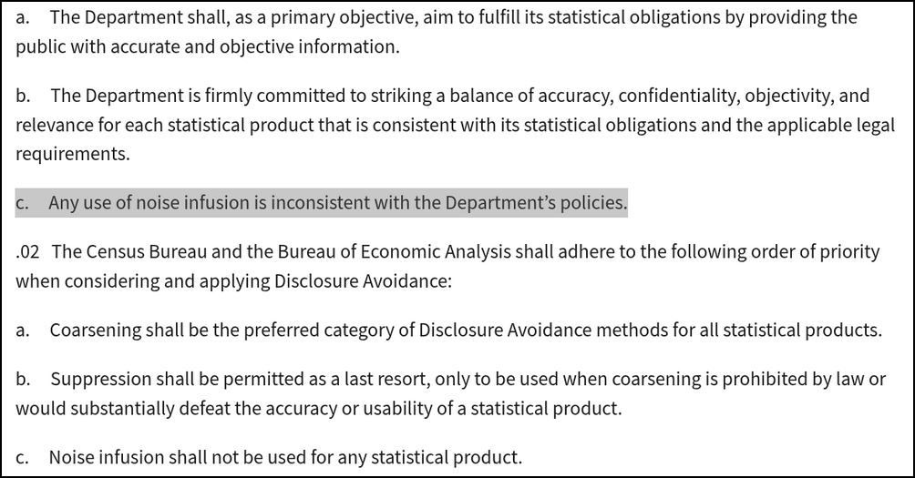
The administration has now decided that noise infusion was no longer an acceptable disclosure avoidance technique.
The order clearly targets differential privacy, but also seems to impact other techniques that involve randomness: the text explicitly mentions that coarsening should always be preferred, falling back to suppression as a "last resort". I have no idea why the order is so specific. Maybe they wanted to make sure the scientists working at the U.S. Census couldn't still use similar techniques without calling them differential privacy?
The order also carefully says it "shall not be interpreted to conflict with any constitutional, statutory, regulatory, or other legal provision". So the confidentiality obligations surrounding these statistical products still apply.
What will it mean in practice?
The consequences will be dire for utility or for privacy, and possibly both. It's hard to understate this point: future statistical releases will either be useless compared to past ones, or they will be incredibly unsafe.
For starters, taking away useful tools from the disclosure avoidance toolbox will always lead to more painful privacy/utility trade-offs. The whole point of this research field is to better understand and quantify privacy risk, and develop better tools to mitigate this risk while preserving utility.
For statistical releases, differential privacy is simply the best tool we have right now. It provides a finer way of quantifying trade-offs, and allows us to get more utility out of the data than competing techniques at similar privacy levels. If you take it away, you're left with techniques that either have worse utility at similar levels of privacy, or worse privacy for the same utility.
But all competing techniques also rely on noise addition. The Cell Key method, used at other statistical agencies, adds noise to statistics. Swapping, used from 1990 to 2010 for the U.S. Census, also injects randomness into the process. Sampling is everywhere in statistical work2. Hell, even imputation technically adds noise to the data3!
By contrast, coarsening and suppression are very blunt instruments. They only work in situations where the statistics are already very coarse, and not too many of them are published. For complex data products with many statistics about small groups of people (like the U.S. Census), they either destroy all utility of the data (especially for minority populations), or are very vulnerable to privacy attacks.
It makes sense: privacy attacks on statistical releases are about solving a system of equations. It is such an easier task when you know for sure that the statistics are all perfectly accurate. Noise forces you to compute probabilities, quantify the uncertainty, carefully consider baselines, and so on. That's why randomness is such a useful tool for disclosure avoidance! Even without formal guarantees, it makes attacks a lot harder. Take it away and attacks become trivial.
Why is it happening?
I mean, who knows.
Maybe the goal is to force the U.S. Census to publish statistics that actually enable re-identification, to help with future gerrymandering efforts? Or on the contrary, maybe the idea is to stop the publication of useful demographic data, to prevent researchers from showing unfair disparities among the population?
Hanlon's razor provides an alternative explanation. The fundamental privacy/utility trade-off inherent to statistical data releases is annoying. It would be a lot easier if publishing many statistics didn't automatically come with a high privacy risk. Differential privacy makes this trade-off explicit, and thus impossible to ignore. Maybe banning it is a way of pretending that the problem doesn't exist, in the hope that it will go away?
Thanks to Adam Sealfon, Aloni Cohen, Ben Jacobsen, and Gautam Kamath for helpful comments on earlier drafts of this post.
-
Sadly for math-brained people like me, it turns out that very few choices made in the real world depend on the elegance of the underlying math. ↩
-
Maybe sampling doesn't count as noise infusion? But if you take a random sample of a population and estimate a total statistic based on the sample… this statistic will be noisy. ↩
-
Thanks to Adam Smith for pointing this out. It is almost funny, in an extremely cursed sort of way, to imagine doing statistical data releases without any imputation. Maybe there's a paper to be written here, to formally quantify the effect of imputation using the language of differential privacy, similarly to what was done with swapping. ↩